
Appearance
Wind and other velocity fields
A query that returns a regular grid of velocities becomes a Streamlines layer: an animated field of streamlines, the paths a massless particle would take through the grid. Nothing to configure to get one — give the panel coordinates and a velocity and the layer appears — and everything to configure once you have it, in the layer's own panel inside the map.
sql
SELECT ts AS "time", lat, lon, speed, direction
FROM wind_grid
WHERE level_hpa = 700
ORDER BY lat, lon;
This one is not a table of places
Every other layer draws your rows. This one does not. The rows describe a grid of vectors, and what gets drawn are paths traced through that grid — geometry the layer computes at draw time, which your query never contained.
Your rows do reach the map: the dataset holds the lattice the query returned, columns and all, and the layer is pointed at the ones that carry the velocity. What it draws is not in them.
That has a few consequences worth holding on to: the number of lines has nothing to do with the number of rows, the lines are recomputed when you pan or zoom, and there is nothing to hover — a streamline is not a row.
The dots are the grid
kepler also guesses a Point layer from the same coordinates. The panel removes it: those dots are the lattice itself, honestly drawn and not what the query is about. Add one back from Add Layer if you want to see where your samples are.
Three ways to give velocity
Two of them name the velocity directly; both pairs are all-or-nothing, since half of one describes nothing. The third does not name a velocity at all — it derives one from a single scalar column.
Speed and direction
What most sources give you: Open-Meteo, GFS, national weather services.
| Role | Detected from |
|---|---|
| Speed | wind_speed, windspeed, wind_speed_10m, speed, ws |
| Direction | wind_direction, winddirection, wind_direction_10m, direction, wind_dir, wd |
direction is read as the meteorological convention by default: the bearing the wind blows from. A direction of 270° is a westerly — air moving towards the east. If your source gives the direction of travel instead, as ocean currents often do, set Field → Direction is to Where it goes in the layer's panel.
Ask the source rather than guessing, because a field drawn backwards looks entirely plausible. A CF-compliant dataset says which it means in the variable's standard_name: ..._from_direction needs no correction, ..._to_direction needs Where it goes. Wave data is where this bites — the word "oceanographic" suggests direction of travel, but WAVEWATCH III's peak wave direction is published as sea_surface_wave_from_direction_at_variance_spectral_density_maximum, a from direction like the wind.
U and V components
| Role | Detected from |
|---|---|
| U (eastward) | u, u10, u_wind, wind_u, ugrd, u_component |
| V (northward) | v, v10, v_wind, wind_v, vgrd, v_component |
ugrd and vgrd are the GRIB2 short names GFS ships, so a table converted straight from a GRIB file needs no renaming at all.
The columns are the layer's, not the panel's
Autodetection only picks the layer's opening guess. The four velocity columns are chosen in the layer's own Columns section, which also carries the switch between the two spellings — so a query whose names are in neither list above needs no aliasing, just a different column picked.
The gradient of a value
A single column of numbers over a lattice — terrain height, pressure, temperature, a rainfall anomaly — already describes a flow, and this mode draws it: water runs down a hill the way air runs along a pressure field.
Choose Gradient of a value in the layer's Columns section and point value at the column. There is no role for it and nothing detects it: any numeric column could be a scalar field, and a panel that guessed would turn every query with an elevation column into a flow map. The choice is yours to make, on the layer.
Field → Direction then decides what the gradient means:
| Direction | What it draws |
|---|---|
| Downhill | The fall line — runoff over a terrain model. The default. |
| Uphill | The same lines, reversed. |
| Along the contours | A quarter turn, so the flow runs along the level lines with the high ground on its right. |
The third is the one that makes sense of pressure or temperature: air does not pour off a high, it circles it, which is the geostrophic reading of a synoptic chart. Downhill over a pressure field draws something that looks plausible and is wrong.
The colour ramp means slope here, not speed
These vectors are a gradient, so their magnitude is metres of fall per metre travelled — a slope, not m/s. The animation is unaffected, since the tracer normalises it to a legible number of pixels per cycle either way, but Colour by speed is colouring by steepness.
Smoothing matters more in this mode than in any other. A derivative amplifies whatever noise the samples carry, and one bad sample in a terrain model becomes a pit steep enough to turn the flow beside it back up the real slope. It is applied to the scalar before the derivative is taken, so Field → Smoothing is smoothing the ground rather than the flow.
When the wind is in an archive, not in a table
A forecast archive holds the two components already, but it is not a table and no SELECT reaches into it. Both roles still arrive as ordinary columns — the tile server is asked for the whole lattice at once and the query turns its answer into rows. Worked end to end, with the trap that makes the field look calm instead of broken: a wind field from an Icechunk archive.
When the field is on an ERDDAP server
Oceanographic agencies publish through ERDDAP, and it will hand you a rectangle of any gridded dataset as headerless CSV — so read_csv is the entire adapter, with no extension and no client library. The roles arrive by aliasing two variables to speed and direction. The trap there is the land mask: a cell the model does not cover must be absent, never a row of NULLs, because Number(null) is zero and zero draws as dead calm. Gridded ocean data from ERDDAP.
What disqualifies a query
A trip id column. A GPS trace that happens to carry a speed column is a trajectory, not a field, and shredding it into streamlines would draw lines that mean nothing. The rule is explicit: coordinates, plus a velocity pair, and no trip id.
The grid
The grid must really be regular
The axes are inferred, and the values have to lie on a regular lattice within 5% of the inferred step. A source that snaps your requested coordinates to its own model grid — Open-Meteo does — will break that: the inference fails, the field is never built, and you get rows in the panel, an empty map, and no error anywhere.
Round the coordinates back to the lattice you asked for, and space that lattice wider than the snapping error. See Tutorial 6.
Rows are cells. The grid itself is inferred, so the query may return them in any order — ORDER BY lat, lon is for your own benefit when you inspect the rows, not the panel's.
When the query spans several timesteps, every one of them reaches the map — nothing is dropped at the panel. The map's own clock, at the bottom, is what chooses which hour the field draws: always the latest hour still inside the clock's window. Narrow the window and an earlier hour becomes the one on show; widen it back out and the newest hour wins again. A query of one timestep needs none of this — the clock stays put and that one hour is all there ever is to choose from.
The clock walks one query. kepler binds its time filter to the first dataset on the map that carries a timestamp, so a second velocity query with hours of its own — a second level, say — keeps drawing its latest hour whatever the clock says. Several levels at once, below, has the way to stack levels that walk together.
Holes are holes, not calm air
Cells the query omits are treated as absent, and streamlines stop at their edge. This is the mechanism for excluding a pressure level that runs below ground: omit those cells and the lines end at the mountains, instead of drawing weather through rock.
sql
SELECT ts AS "time", lat, lon, speed, direction
FROM wind_grid
WHERE level_hpa = 700
  AND surface_pressure_hpa >= 700   -- drop cells where this level is underground
Smoothing
The field is blurred before tracing, over a radius of 3 cells by default — the same smoothing Esri's own wind demo applies. At a 0.25° grid that is roughly 28 km per cell, so the blur averages over about a synoptic feature: enough to stop the tracer jittering between adjacent cells, not enough to erase anything a 25 km model actually resolves.
Smoothing (cells) under Field changes it. Zero traces the grid as it came, which on a coarse lattice makes the lines visibly wobble between cells. In the gradient mode the same knob blurs the scalar before the slope is taken from it, where it is doing considerably more than tidying.
The lines follow the view
The field animates itself
There is no play button to press. The streamlines run on a clock of their own, because what moves along them is a trail rather than the weather: the tracer normalises the speed to a legible number of pixels per cycle. The map's own timeline is left for the data.
Switch Animation → Animate off for a still field: the streamlines then draw end to end, which is the version to print or to read rather than watch. A system set to reduce motion gets that field without asking, and a panel scrolled out of the dashboard stops animating until it comes back.
Density and on-screen length hold steady as you zoom: a fixed budget of lines per screen, each about the same number of pixels long. Only the share of the screen your data actually covers gets drawn.
The lines belong to the ground, not to the screen. A pan keeps every line already on screen exactly as it was and traces only the ground that has just come into view. A zoom — anything from a sixteenth of a zoom level up — re-traces the view at its new scale: each line keeps its place and its moment in the cycle but is drawn again to the new length, and a lifted level to its new height. Zoom far enough and a finer or coarser set of lines takes over, which reads as the field filling in or thinning out rather than reshuffling. How far a line runs is scaled by the typical speed of the whole field, not of the part on screen, so panning from slack air into a jet does not stretch the slack lines to match.
The lines are seeded by picking points on the screen and asking the camera what ground is under them, so a tilted or rotated map is covered to its edges. That matters more than it sounds: tilt the camera and the ground on screen stops being a rectangle and becomes a trapezoid reaching towards the horizon — measured at a pitch of 50°, two and a half times deeper up-range than the flat rectangle is tall. A field seeded into the rectangle simply stops halfway up the screen.
Re-tracing reads the grid already in the browser, so panning costs no database work, and it does not touch the dataset.
Density
Lines per screen under Streamlines: 9,000 by default, from 500 to 20,000, and per layer. Stack three pressure levels and each asks for its own allowance, so lower them together if the levels stop being tellable apart.
What the budget is for
Zoom response, next to it, decides that — and it is what to reach for when zooming in does not feel like zooming in.
At 0, the default and what this drew before the knob existed, the budget is for the screen: the same number of lines whether the screen shows the whole field or a corner of it, so the map looks the same at every scale. That is Esri's model, and it is the right one for a map that is looked at at one scale.
At 1 the budget is for the field: zooming in shows only the share of it that is on screen, so the lines thin out and separate as you go in. Measured on the tutorial's grid, a map holding 3,100 lines zoomed out drops to 930 zoomed three levels in — the field opens up instead of staying uniformly busy.
In between the two are blended, which is usually where a map that is read across several scales wants to sit.
There is no figure that suits every map:
- A country covering a third of the view wants more lines than a pair of three-kilometre patches around two weather stations.
- A field of parallel arrows reads as a solid block at a density a swirling one reads well at.
- Zooming into a single station's patch fills the screen with what was a comfortable count across a country.
Lower it when the field looks matted; raise it when it looks sparse. For reference, Esri's own demo spends 6,000 on a single field, so the default is deliberately generous.
Several levels at once
One query per level, in the same panel. Each becomes its own layer.
With a forecast, only the first level walks
The map's clock binds to the first query that carries a timestamp, so in a stack of one query per level only that level follows it; the others stay on their latest hour. To walk them all, return every level from one query, side by side as columns of the same rows — u850, v850, u700, v700, one row per cell and hour — and add a Streamlines layer per level on it, each pointed at its own columns in the layer panel. Stacked as rows instead, with a level column, the levels land on the same cells and overwrite each other. Otherwise, accept that only the first level follows the clock.
To separate them in the vertical, give each layer a height and tilt the camera with the 3D control. Two ways, and the layer takes the first that applies:
- A height column — return one and bind it to the layer's optional
altitudecolumn. When it barely varies it is the level's height: if the spread from its lowest value to its highest is no more than a tenth of its mean, the level is drawn flat at that mean. That is what a pressure level's real height does — 850 hPa's geopotential height runs from about 1,450 to 1,550 m across a region, 100 m on a mean of 1,500, under 7% — so returning it keeps the level in its place in the stack. - Height (m), when no column — under Field. For the ordinary case, where the height of a level is a property of the query rather than of its rows and there is no column to return.
A height column that varies by more than a tenth of its mean is not a level but terrain: every vertex of every line takes the height under it, multiplied by the vertical exaggeration below but not scaled with the stack, so the lines follow the ground. Near sea level any real relief counts — a tenth of a mean of a few metres is next to nothing — so a coastline is always terrain.
Where that rule guesses wrong
A plateau whose relief is under a tenth of its height — a patch of the Altiplano around 3,800 m with less than 380 m between its lowest cell and its highest — reads as a level: one flat sheet at its mean height, lifted with the stack like any other level, rather than laid on the ground. The other way round, a level over a continent-sized map with a deep low in it can spread past a tenth (850 hPa from 1,250 to 1,600 m is 25%) and is laid out as terrain. Setting the level with Height (m) instead of a column always keeps it in its place in the stack.
Height is opt-in either way. Nothing autodetects an altitude: an elevation column picked up by accident lifts a layer kilometres into the air, where it vanishes as soon as the camera descends below it.
The exaggeration is computed for you, and it is not a fixed factor. Pressure levels a few kilometres apart are invisible over a country hundreds of kilometres wide — 1000 to 700 hPa is 2.9 km over about 650 km, four parts in a thousand — so the stack is scaled to a share of the current view instead, about 15% of its width. It is derived from the tallest level on the map, not from each layer's own height, so the levels keep their real proportions to each other and the stack occupies the same share of the screen at every zoom.
Vertical exaggeration under Field multiplies that. Set it the same on every level, or they stop being in proportion.
The two height knobs do different jobs
Because the exaggeration normalises the tallest level on the map, the metres of a single layer decide only whether it sits on the ground or is lifted — not how high it is drawn. That is the exaggeration's job.
The metres earn their keep with a second level: they are what puts 850 hPa and 700 hPa in their real proportion to each other. One layer at 3,000 m and one at 500 m draw six times apart; one layer at 3,000 m on its own draws exactly where one at 500 m would.
Arrows and wind barbs
The same grid can be marked instead of traced. Switch the layer's type to Vector field in its panel — or add one from Add Layer — and every column, the colour ramp and the speed range carry over.
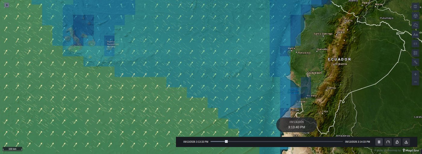
| Knob | Does what |
|---|---|
| Symbol | Arrow points where the flow goes. Classified arrow sizes and colours it by class — as many classes as the ramp has colours, the same bins as the legend. Wind barb is the WMO symbol, its staff pointing where the wind comes from. |
| Data speed unit | Barbs only. Barbs count in knots — a half barb is 5, a full barb 10, a pennant 50 — so the layer needs to know what unit the query is in. |
| Size, Size by speed, Size range | A fixed size in pixels, or a size between two that follows the speed. |
| Placement | Screen grid puts one symbol in every cell of the screen, interpolated, the same density at every zoom. Data cells puts one on every sample the query returned, exactly as it came. |
| Spacing (px) | The screen grid's cell, 50 by default. |
Barbs south of the equator fly on the other side of the staff, as the WMO convention has it, and a field over Ecuador draws both. Over a gradient there is no wind to count in knots, so the layer offers arrows only. Smoothing starts at 0 here: a symbol on a sample should show that sample. That is only true of a layer added fresh, though — kepler copies a knob to the new type when the name matches, so a layer switched from Streamlines keeps its smoothing of 3, and switching it back brings that 0 along with it.
Styling
Every knob is in the layer's own panel, grouped as Colour, Streamlines, Animation and Field.
| Knob | Where | Does what |
|---|---|---|
| Colour by speed | Colour | On, each line takes its colour from its mean speed through the ramp below. Off, the whole field is one colour. |
| Opacity by speed | Colour | Fades each line from Opacity in calm air (0.2 by default) up to opaque as its speed rises. Off by default. |
| Fixed speed range | Colour | Measures colour, width and opacity against Range (min, max) instead of the field's own range. Off by default. |
| Lines per screen | Streamlines | The density budget. |
| Zoom response | Streamlines | Whether that budget is for the screen (0) or for the whole field (1). |
| Stroke width | Streamlines | Line width in pixels, so it holds as you zoom. |
| Width by speed | Streamlines | Replaces the one width with Width range (px): slow lines draw at its low end, fast ones at its high end. Off by default. |
| Trail length | Streamlines | How much of the cycle the moving trail spans, as a percentage. |
| Speed contrast | Streamlines | How much longer a fast trail is than a slow one: 1 keeps the real contrast, 0.5 turns ten times the speed into about three times the trail, 0 draws them all alike. 1 by default. |
| Line length | Streamlines | Vertices per streamline — how far a line reaches, not how much of it is lit. |
| Animate | Animation | Off draws the streamlines whole and still, and asks for no more frames. On by default. |
| Cycle | Animation | The length of the loop, in seconds. |
| Line lifetime | Animation | The share of the cycle one line lives for, and so how much of the field is lit at once. |
| Seamless loop | Animation | Carries a line whose life runs past the end of the cycle round to the start of it. On by default. |
| Smoothing | Field | Blur radius in cells, not kilometres — so the same number means something very different on a 0.25° lattice and on a 0.5° one. |
| Height (m) | Field | What this level is, when no altitude column is bound. Counts against the other levels. |
| Vertical exaggeration | Field | How tall the stack is drawn. The one that moves a lone layer. |
Comparing by colour
With Colour by speed on, the ramp is stretched over the speeds of the whole field — every cell of the grid, not just the lines on screen — so panning and zooming never repaint a line. The map's Legend control shows the same ramp, bin by bin, under Speed; in the gradient mode it reads Slope.
That range still belongs to this field, though: two levels, two panels, or two moments of a forecast each get their own, and cannot be compared by eye. To compare them, switch on Fixed speed range in each and give them the same Range (min, max). The first time it is switched on it starts at the field's own range, rounded outwards to the slider's step. A speed beyond it takes the colour at that end of the ramp.
When the magnitude itself is the point, a layer underneath can still paint it with breaks of its own — see painting the field as well as tracing it.
Width by speed and Opacity by speed follow the same range the colour does, so all three agree on what counts as fast. Each line is drawn at one width and one opacity, from its mean speed. The calm end of the opacity is 0.2 rather than zero on purpose: slack air that vanishes altogether reads as holes in the data.
Trail length is the one that changes the character of the map most: short reads as drifting particles, long as complete streamlines, closer to a classic wind chart. It is a share of the cycle rather than an absolute number, so lengthening the cycle does not silently shorten every trail.
That share is a time, so what a trail measures on screen is how fast it moves — and it moves with the wind. Over an ocean at 10 m/s beside a continent at 2, the continent's trails are a fifth as long and read as dots; lengthening the trail lengthens the ocean's too. Speed contrast is the knob for that: it compresses the difference around the field's typical speed, so a field that is the same everywhere is left exactly as it was. At 0.5 the continent's trails come out at nearly half the ocean's instead of a fifth. Only the drawing is compressed: colour, width and opacity still read the real speed, so switching one of them on keeps the contrast visible.
Every line lives for a little over half the cycle by default, with births scattered through it, so trails appear and fade continuously rather than the whole field restarting in unison.
Turning the seamless loop off brings back a visible wave
Without it a line has to end before the cycle does. Nothing is then born in the window's last stretch and nothing has been alive long at its start, so the field empties into the loop and refills out of it — measured on the map, the amount of line on screen swings by a factor of two through the cycle, against 3% with it on.
What it costs is a second drawing of every line that crosses the seam: about half again as many lines at the default lifetime, and nearly double at a lifetime of 1. That is the reason it can be switched off at all — a very dense field on a modest machine.
With the seamless loop on, Line lifetime says only how much of the field is lit at once: at 0.55 a little over half the lines are mid-flight at any instant, and at 1 all of them are. Raise it for a fuller field, lower it for scattered particles. Either way the density holds steady through the cycle.
A line cut short by a hole or by the edge of the field lives for less of the cycle than a whole one, rather than being stretched over all of it, so it moves at the pace of the wind it is in. Next to the edges and the holes, fewer lines are lit at once.